Charts Definition
Driving Data Visualization for Liferay's Product Suite
Analytics Cloud is a project of recent creation and as part of the design system team, I guided the product team in the discovery phase and then the final designs of the different charts that were going to be used in the product.
Challenge
Analytics Cloud was one of the newest applications Liferay was building and at the time we didn't have any solution for data visualization.
We tested different libraries and projects from D3.js but none of them met the needs for the application entirely, especially for accessibility. We had a choice to make, building the library from scratch or basing it on an existing project to save time.
We tried a different solution that brought us a different challenge. We reached out to the author of Billboard.js, one of the open-source projects, to contribute our accessibility improvements to the library which ended up in this amazing external collaboration.
As a result, I had to make sure to communicate on two fronts, one to align the designs with our product teams, and the other to make sure everything was integrated with Billboard.
Results & Impact
Increased consistency for the products that integrate charts
An entirely new product was built thanks to these designs
Improved accessibility for chart elements
The accessibility improvements were integrated into an external open-source D3 library
Increased partners' satisfaction when building their custom solutions
Improved the reach of an external open-source project allowing multiple companies to implement accessible data visualization
Learnings
This project required me to handle a new level of communication internally and externally, with product designers involved in multiple features at the same time and making sure our solutions were able to fit inside Billboard. I had to coordinate daily and weekly meetings to align the outcomes with the teams.
The team was located in multiple countries all over the world and we worked remotely with both sync and async communications.
I had to work with developers and stakeholders in different checkpoints to make sure everything was going in the right direction as intended and we were respecting the roadmap.
I was also able to learn a lot about charts and accessibility and used this project as an opportunity to take a course from the Interaction Design Foundation about Data Visualization which opened my mind and increased my knowledge on the subject.
Accessibility
The most challenging part of this task was to make charts accessible and make sure they work in any context, with any color combination, and be as inclusive as technically possible.
Colors
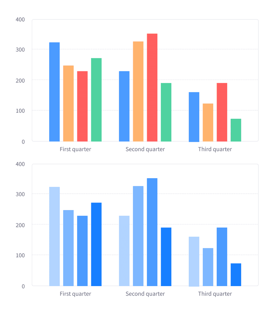
In this project, I had more flexibility in terms of color contrast because we didn't rely just on color to differentiate the elements and the WGA requirements are lower in these cases. So I was able to define 9 new colors to be used for the chart elements, each with 9 different tones.
Differentiate Elements
I also needed to provide a way to differentiate data without relying only on color changes.
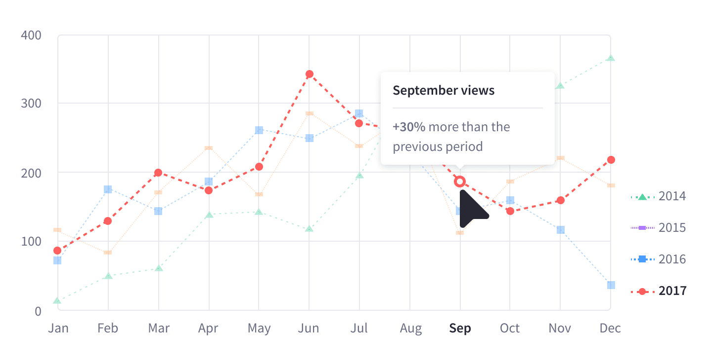
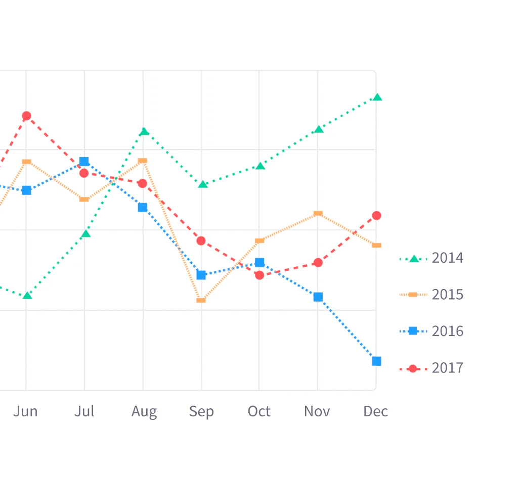
Thus, I defined 9 different tones per each color, 9 different shapes to be used as indicators, 9 different patterns for the background, and 9 different dashed lines.
Highlight vs Lowlight
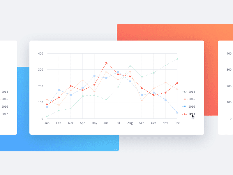
Highlighting data can be hard when there are multiple elements inside a chart, and it can get messy if we start playing with different visual effects such as colors, shadows, or borders.
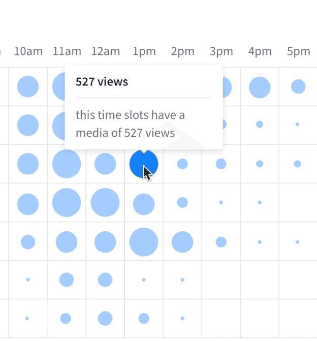
My solution to this was to go in the opposite direction and lowlight the other elements instead when focusing on a specific part of the chart.
Chart Types
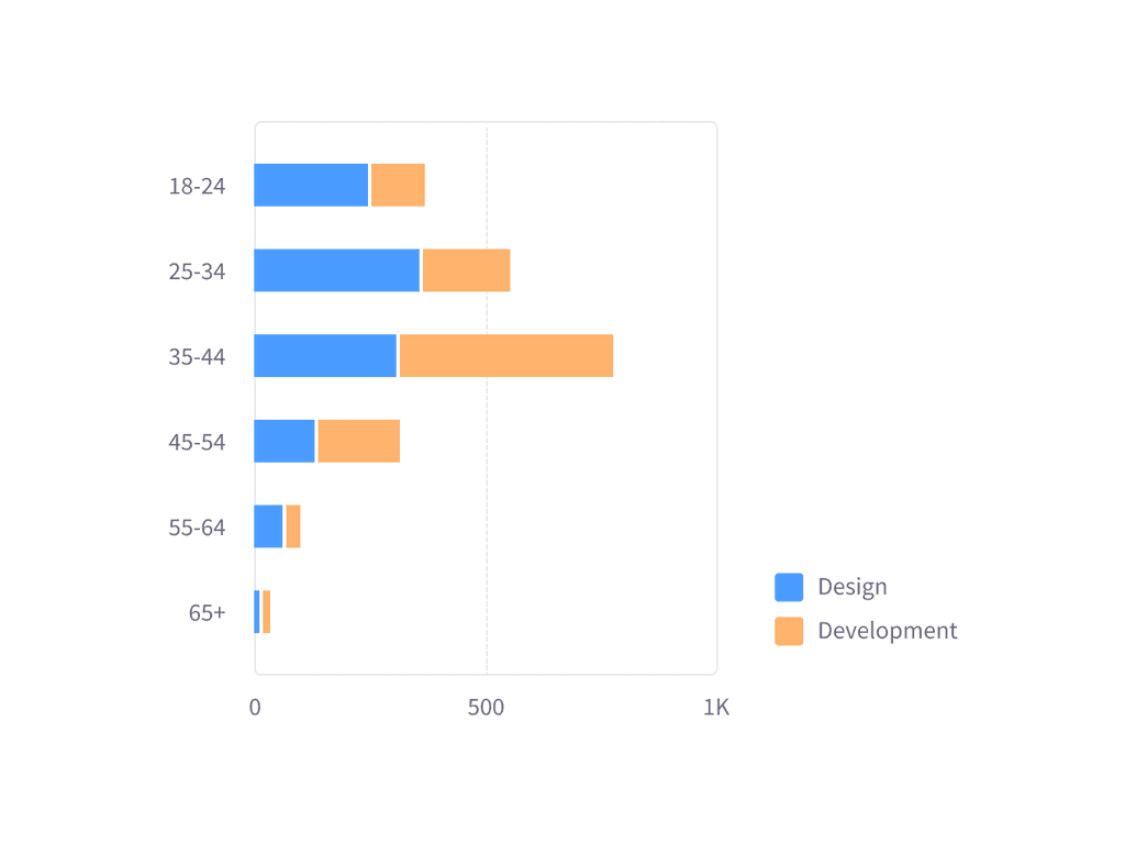
These are some examples of the final results that allowed to have multiple charts and advanced data visualization.
