Image Editor for Liferay Portal
Allowing users to select and edit images while creating content for websites
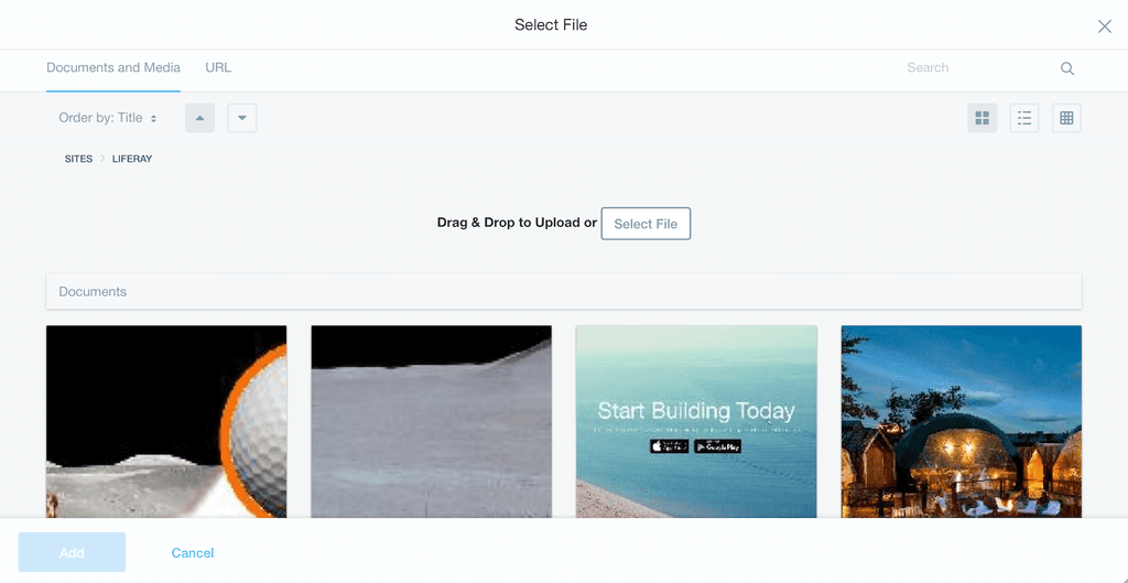
As part of its CMS features, Liferay Portal includes the item selector, which is a modal component that allows users to select and upload files, documents, and images that can be placed in multiple containers with different sizes. The item selector is directly connected to the image editor which allows users to crop and rotate the images to adapt them to all the containers and breakpoints.
Challenge
Item Selector
The item selector had multiple design problems, the first one was the visual style because of the impact it has, it was detached from the branding styles and generated a feeling of low quality when comparing it to other features in the product.
Interactions and contrast also needed some work, and the drag & drop target zone was not clear enough for users to understand where to drop the images. It was also limited to the top part for a technical constraint, and users dropping files near the ones that were already uploaded would see the image opened in the browser directly, interrupting their flow entirely.
Image Editor
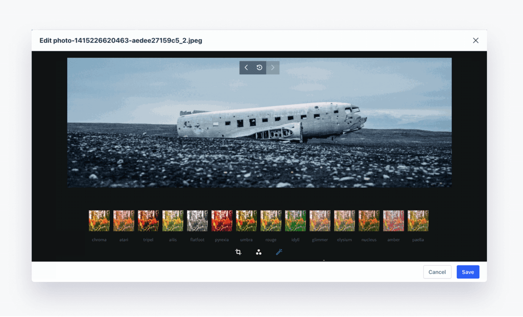
On the other hand, the Image Editor allowed cropping and resizing, but also multiple advanced effects such as managing the brightness, the contrast, and even applying filters to the images like Instagram does.
Separated Flows
On top of these problems, these were two separated components with different flows so if you succeeded in uploading an image, you would still need to figure it out if it was possible to edit it or not. Spoiler alert: most users didn't know.
Approach
Item Selector: Improving the Flow
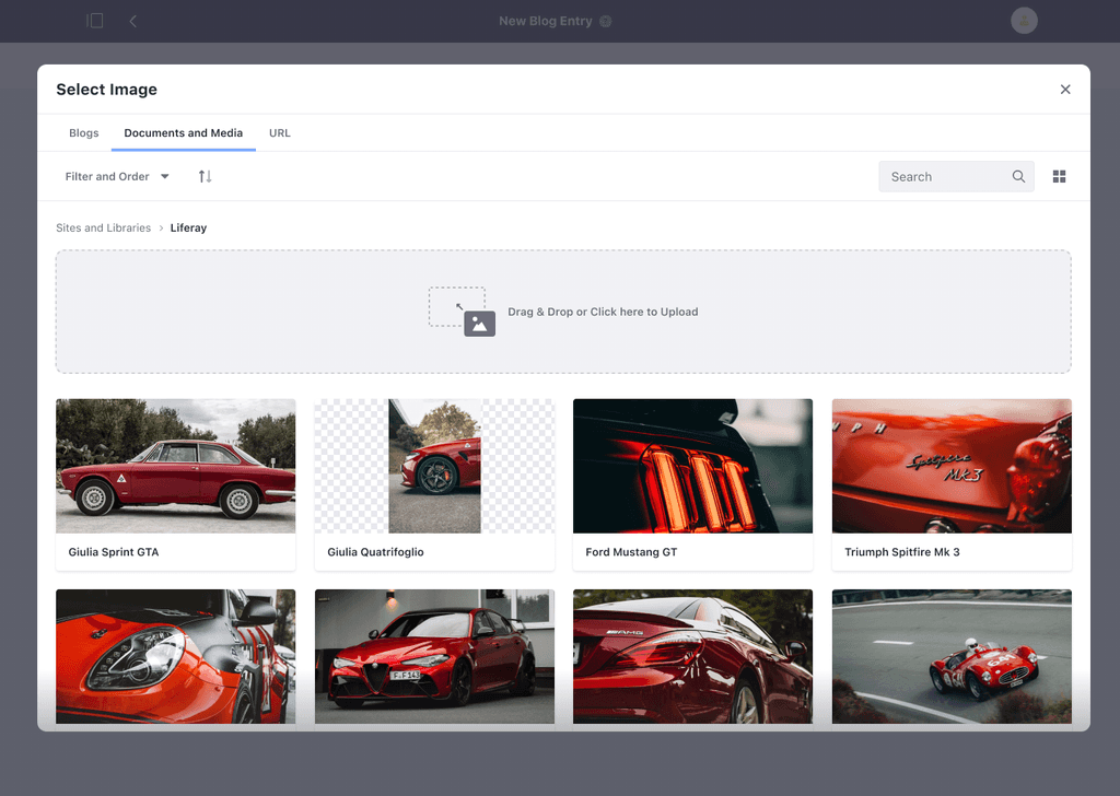
The first step was to connect the styles to the brand and the rest of the product by adapting the spacing, colors, typography, and styles in general.
Then it was time to make the Drag & Drop clearer to the user, especially due to the technical constraint that forces them to drop within a certain area.
I included some styles to differentiate the area and a small image to guide the users, then made the whole area clickable which will open the system's folders.
Previewing Content
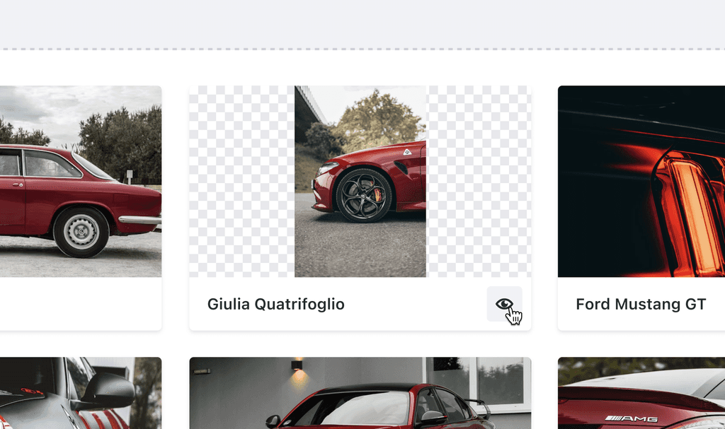
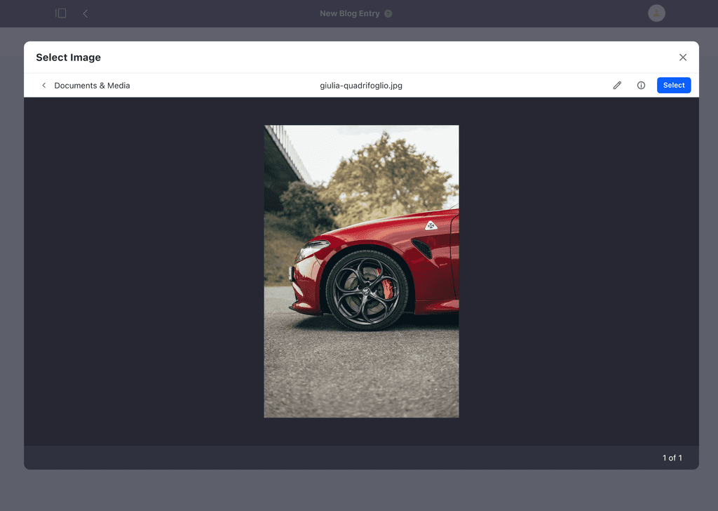
The next change was to include the new cards from the design system and use the action button to provide a preview action. This will keep the modal but change the context so that users focus on the selected image — the item selector also has the multiple selection feature but in this case study I'm going to show the common use case for the product which is the single selection.
Activating the preview removes the selection context and brings a simple toolbar with back navigation, the file name, and the possible actions. It's possible to select the image through the select button, open the info panel to get information about the file such as size, owner, URL, and lastly, the new direct connection with the Image Editor which allows some simple editions of the image to adapt it to the containers.
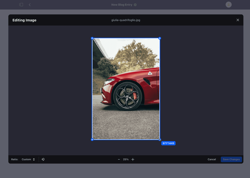
Opening the editor changes the color from $light to $dark to visually communicate the scope of the interface which is now in edition mode.
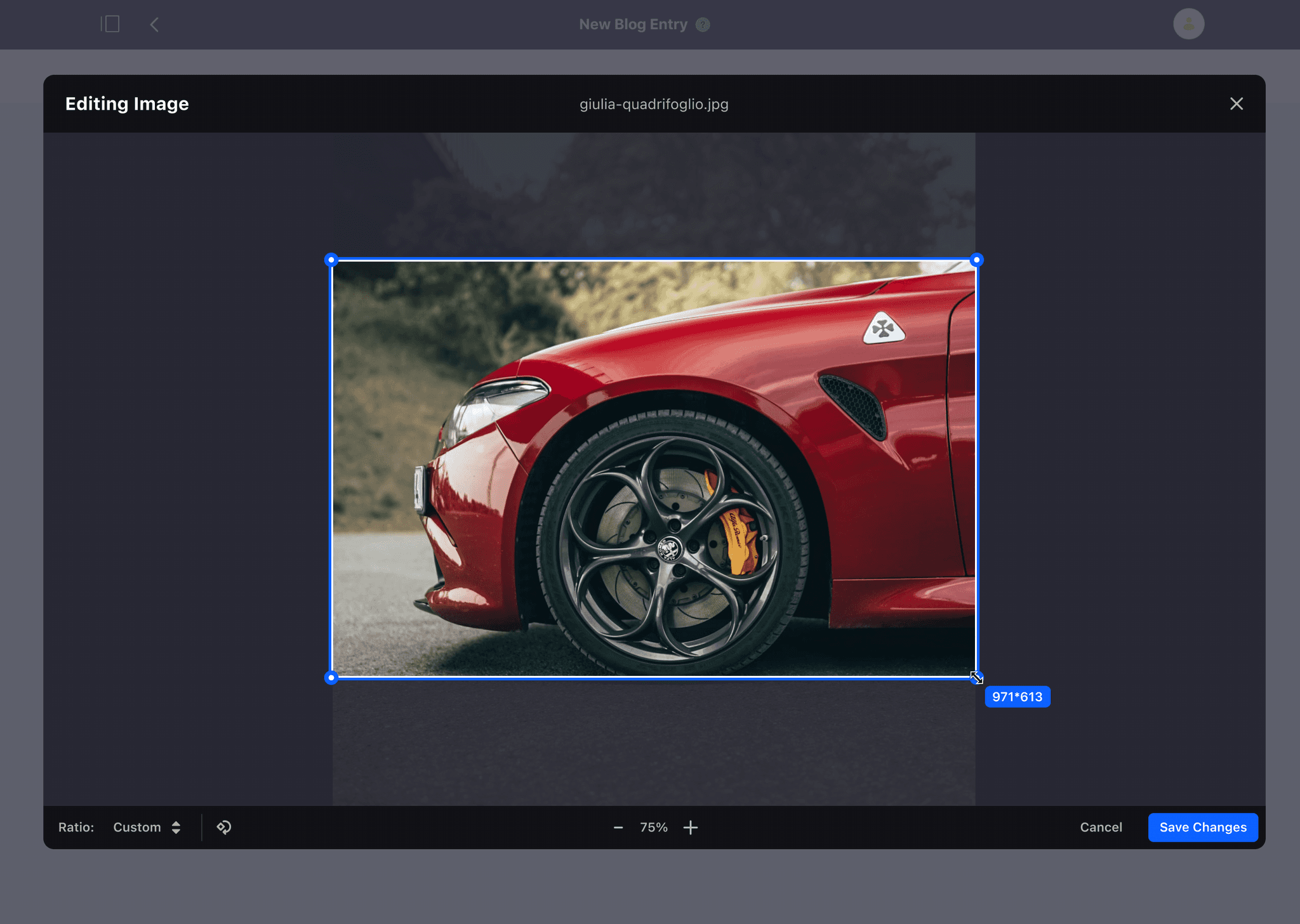
Once a change is made, the "Save Changes" button will become available and it will simply bring users back to the selection mode.
Image Editor: Removing Complexity
The idea behind this proposal was born due to the filters and advanced settings allowed by the image editor. I hypothesized that the product was maintaining advanced features for a very small audience.
This brought me to request a focus group with some of our customers (with the help of the research department and product management) to learn how they used these features and be confident affirming that most of these settings weren't necessary for our users.
Focus Group
Liferay customers are big companies such as Hewlett-Packard and what we assumed was confirmed by the focus group, most clients normally have a pre-defined structure for tasks that include editing images and thus the user creating a page is usually different than the user who has edited and shared the assets.
Even when the user is the same, image editing is often done using external software such as Photoshop which allows to use way more advanced features and make sure to cover the different cases of advertising campaigns.
In conclusion: most of the features from the image editor were superficial for our customers and its users. We were maintaining features that no one needed.
Refactoring
The research results allowed me to know the customers' needs and be confident in proposing the removal of the superficial features to improve the experience and also reduce the costs of maintenance.
I planned a refactoring of the image editor with the following actions:
Removed features
Effects
Brightness
Contrast
Filters
I Also Proposed Some Additions
Cropping Ratios: includes the most common screen ratios to help users crop their images.
Cropping Indicator: I also included a size indicator near the mouse to show the final size of the image using pixels which is shown only when the mouse is pressed.
Rotation: allows the rotation of images with limited steps of 90 degrees to help in specific cases such as backgrounds or patterns.
Zoom: the possibility to zoom in/out was missing from the original editor so we decided to include it to allow a more detailed cropping.
With all these changes, the refactoring of the image editor was completed and presented in a new simple way to solve specific needs and without filler features.
Results & Impact
Simplified the complexity of the item selector and image editor
Improved the user experience when selecting/editing images
Increased customer's efficiency when selecting/editing images
The combination of Zoom & Crop improved the outcomes for customers
Improved the interactions and flows, especially the drag & drop feedback
Partners are now able to include their custom ratios to cover specific devices
Learnings
I learned to communicate and negotiate features with product managers and team leads, having to cut things out requires justification and confidence to make decisions.
Participating in the focus group allowed me to gain that confidence and decide with the team the new direction for the refactoring.
I also helped the team select an external library to bring these features so I learned to compare different solutions and aim for what solves the specific problems we're trying to solve.
I prepared multiple designs and styles that were then discarded because of the constraints, this project was very limited technically and I learned that talking to developers in the early stage is essential to drive any kind of improvement.

