Lexicon Design System
An inside look at Liferay's components, libraries, and design system
Used By
5 Products
35+ Designers
300+ Developers
3 Design Libraries
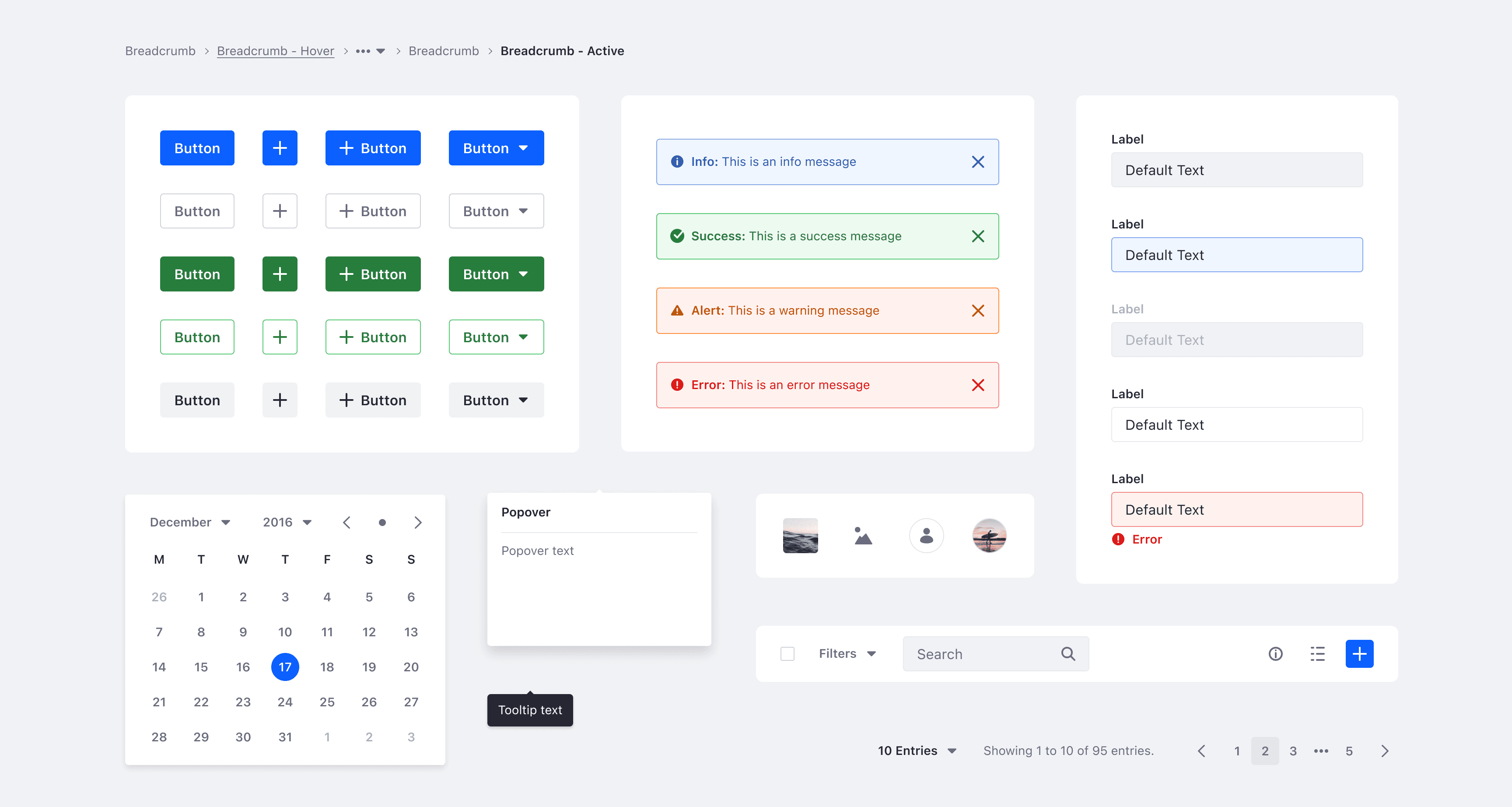
Components
Charts
Icons
Documentation
Confluence
Custom Website
Made from scratch
Figma
React
Storybook
I’ve been helping the Lexicon team build and extend the design system, making it flexible and user-friendly for the product teams. The journey has been both challenging and rewarding, reflecting the dedication and creativity of the whole team.
Challenge
Liferay was transforming from a single-product company into a multi-product one without a design system in place which resulted in efficiency problems such as inconsistencies, and design/development debt.
Product teams worked in silos and built multiple solutions for the same problem, we found multiple styles and implementations of the same components such as tables, modals, buttons, and navigations.
There was no guidance for teams to use the styles or the components, we've found light colors used for important information, buttons used as tabs, nav bars included as part of panels, and sidebars over sidebars with modals that opened on top.
Other than that, updating a simple color was something that required multiple manual interventions in multiple files that consumed a lot of time and was not effective at all.
It was a clear message that building a design system was the right direction to go.
Approach
Gathering Information
The team started auditing the core product with all the features that were already implemented to understand the company's needs. We talked with product and support teams to gather the information necessary to begin facing the problems we needed to solve.
At the same time, we started prioritizing the different components by usage in the product such as Buttons, Tables, Modals, Lists, etc.
Testing Styles Guides
I created multiple style guides with different colors, typography, and spacings and applied them to some of the most used components in the product, this way I would have a clear vision of what was working and what wasn't and could improve the styles. In the end, the final styles included everything the product needed.
Result: even 7 years later, these styles are still solid and we only needed to update a few small details for accessibility purposes (such as border colors).

Design Within Product Teams
When we started the project product teams were using a shared UI Kit made in Sketch that wasn't connected to development. Some of the styles were implemented in the product but everything was disconnected with a single usage.
This allowed us to review everything and build the system from scratch with all our custom styles, components, and interactions.
We improved the Sketch library (letter switched to Figma) with the new foundations and components and created the documentation as guidance for product teams to use the design system.
Result: designers from product teams now can only focus on designing for the products instead of having to make sure the components are working properly.
Documenting Everything
We've documented every single detail to make sure development would be able to implement the designs seamlessly. This included design guidelines, components, and interaction patterns.
Implementing Components
Each designer in Lexicon led a component/pattern through the entire process, making sure it followed the right workflows and quality checks.
Result: as for the styles, the components had a very solid definition that allowed us to scale up the product with new features.
Assisting Teams and Alignment
Communication is always crucial so we integrated the Lexicon Hours which allowed us to connect with product team designers to hear their problems and recommend how to take advantage of the design system in favor of their use cases.
Result: we became mentors for the design team, guiding them when in doubt which resulted in learning what product teams were going to work on even before product managers. We helped lead the product features and coherence.
Results & Impact
Learnings
This position allowed me to cover different roles inside the design team and thus learn a lot about multiple design fields.
I was able to apply visual design to digital products and interfaces, learning how to define feasible proposals with detailed considerations for the accessibility requirements.
I've learned how to work with complex and detailed interactions and how to design scalable solutions covering all the use cases.
I also had to communicate and negotiate with stakeholders, developers, and tech leads to share my ideas and proposals.
Examples
A design system is complex to showcase due to the multiple fields of impact. In this section I'll try to include various examples of the work I've done where I was the main contributor as product designer.
Colors
Colors are one of the foundational elements I worked on which allowed us to align styles and tokens while building an accessible design system.
$White
#FFF
$Light
#F1F2F5
$Dark
#272833
$Primary
#0B5FFF
$Secondary
#6B6C7E
Disabled
#B3CDFF
Selected
#80ACFF
$Primary
#0B5FFF
Hover
#0053F0
Active
#004AD7
Color Contrast
Liferay is used by multiple governments and Fortune 500 companies in the world with accessibility requirements that make color contrast one of the pillars of our foundations.
$Dark
14.6:1
$Primary
5.12:1
$Secondary
5.15:1
$Success
4.74:1
$Warning
4.61:1
$Error
4.59:1
$Info
4.74:1
Drag & Drop
Liferay's core product has multiple CMS features that allow managing image files, documents, folders, pages, articles, and many other elements inside multiple views (card, list, and table).
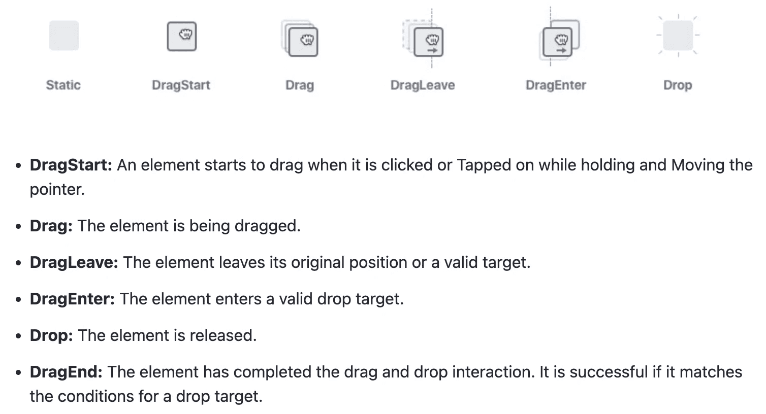
Drag & Drop is one of the interaction patterns I defined for Lexicon taking into consideration all the events and actors needed to build this pattern.
Result: Product teams were able to apply drag & drop in multiple scenarios and future features without any scalability problems. Having this pattern defined and integrated allowed us to apply accessibility improvements.
Design Libraries
One of the goals for the design system was to align designers with development and help them collaborate.
I helped the team by leading the effort of building the design libraries in various stages.
2016: Sketch Library
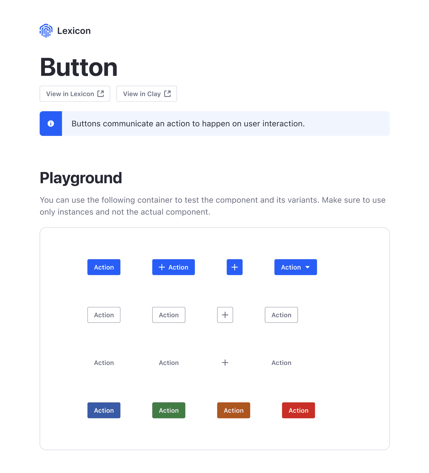
The first outcome was a simple Sketch library with the main components and color styles.
2018: First Figma Library
In 2017 Figma released the team libraries feature which allowed to have similar results as Sketch. I explored their solution and came to the conclusion that overrides worked better, making it easier to learn and use for our designers.
After some time testing and comparing the features I was able to build a new design library using Figma and everyone was able to use it.
2023: New Figma Library
With the latest release of some new interesting features, Figma improved the way components and styles can be organized. Variables were one of those features that made us evaluate the possibility of a new library.
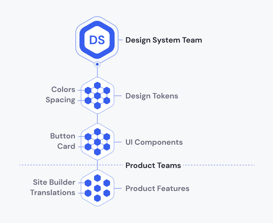
I led the effort of evaluating these features and how to structure the libraries. This time we prepared a structure of 3 library levels: Design Tokens / UI Components / Product Features
Design Tokens: includes the styles, variables, and tokens that come from our brand. This was a necessary level due to the theming capabilities that we're including in the product.
Components: includes the components from the design system that match the development outcome with all the possible variants. It uses the same naming and visuals so that designers and developers are aligned when discussing new features.
Product Features: this includes all the components that were created by product designers to build new features to organize them and have a space where everyone can see what is being built.
Components Work
I've selected 4 components where my involvement as a designer was crucial for building them. Most of the components required communication and alignment with stakeholders, product designers, team leads, and developers.
Color Picker
It has different panels that change based on the user's permission allowing to select predefined colors or customize them entirely.
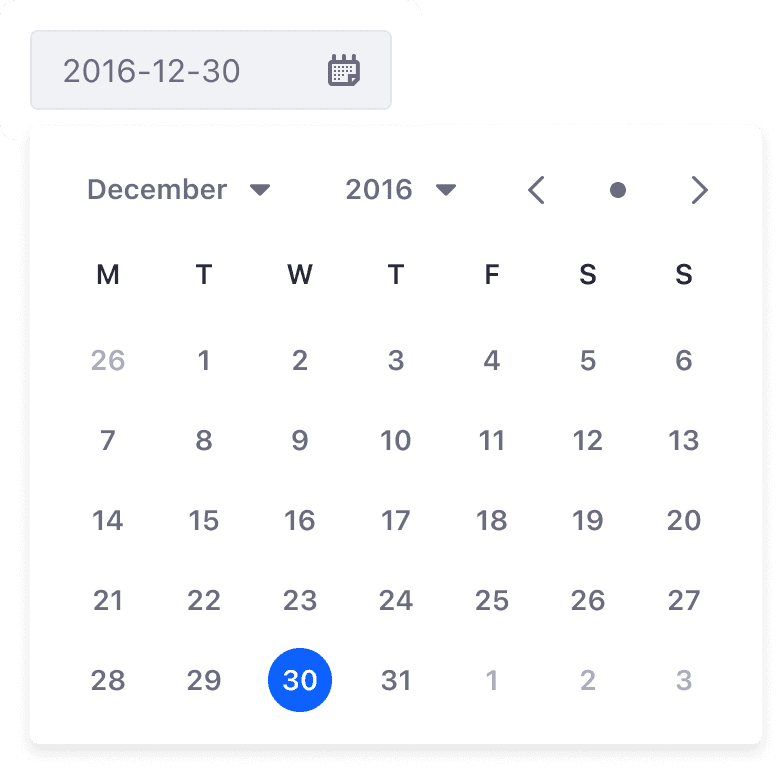
Date Picker
It was required to provide all the native patterns to make them fully customizable and accessible.
Card
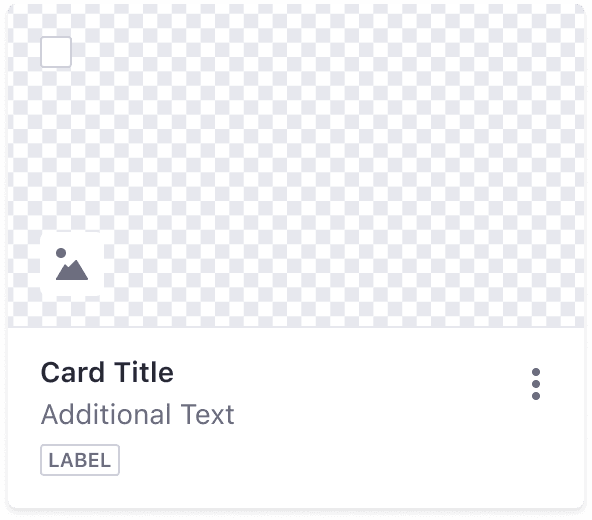
We have different types of cards to cover all the use cases, purposes, and contexts of the multiple products. From representing uploaded documents to showing user's avatars, or transparent images.


