Comments Feature
Integrating collaboration features through comments
Liferay's site builder allows to design of pages and websites based on no-code technology and as a result it needed a way to enhance collaboration and conversations inside the product.
Challenge
Liferay was increasing its no-code features inside its core product, Portal. With these new features, users were able to upload files and documents, manage workflows and pages, create asset collections, and build entire websites with custom elements and components.
The problem? All the communication had to be done outside of the product using external services which made it difficult to refer to specific elements in the different projects.
For instance, when changing a simple button, users had to manually describe how the button was designed and where it was located on the page. A common solution to this was to take a screenshot to have a visual reference of the button and send it to the other person using an external channel such as Slack or Email, it was not very efficient.
Approach
Benchmarking
We took a look at other products that allow to building no-code solutions and how they handle internal communications through comments.
Looking at Figma and Framer, for example, we saw that they allow comments all over the page using absolute positioning and without any connection with the elements inside. Moving an element in these solutions does not move the comment so it's really easy to lose the context of the specific comment once the page changes.
The Proposal
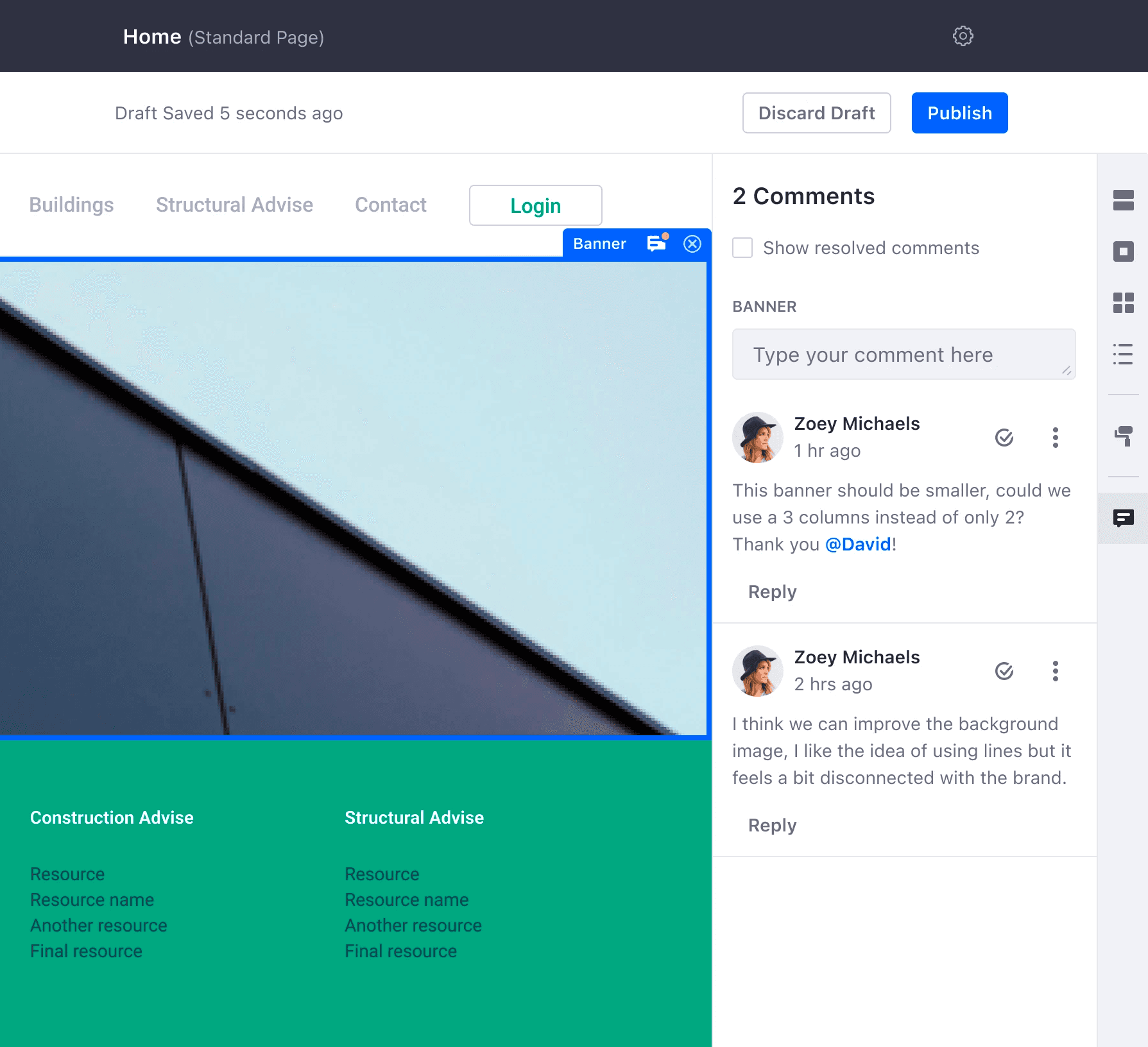
My solution included a similar approach but instead of using absolute positioning I proposed keeping the comments connected to the elements on the page so that when moved between different sections the comments would still follow the elements, allowing the context to remain connected and understandable.
Conversations
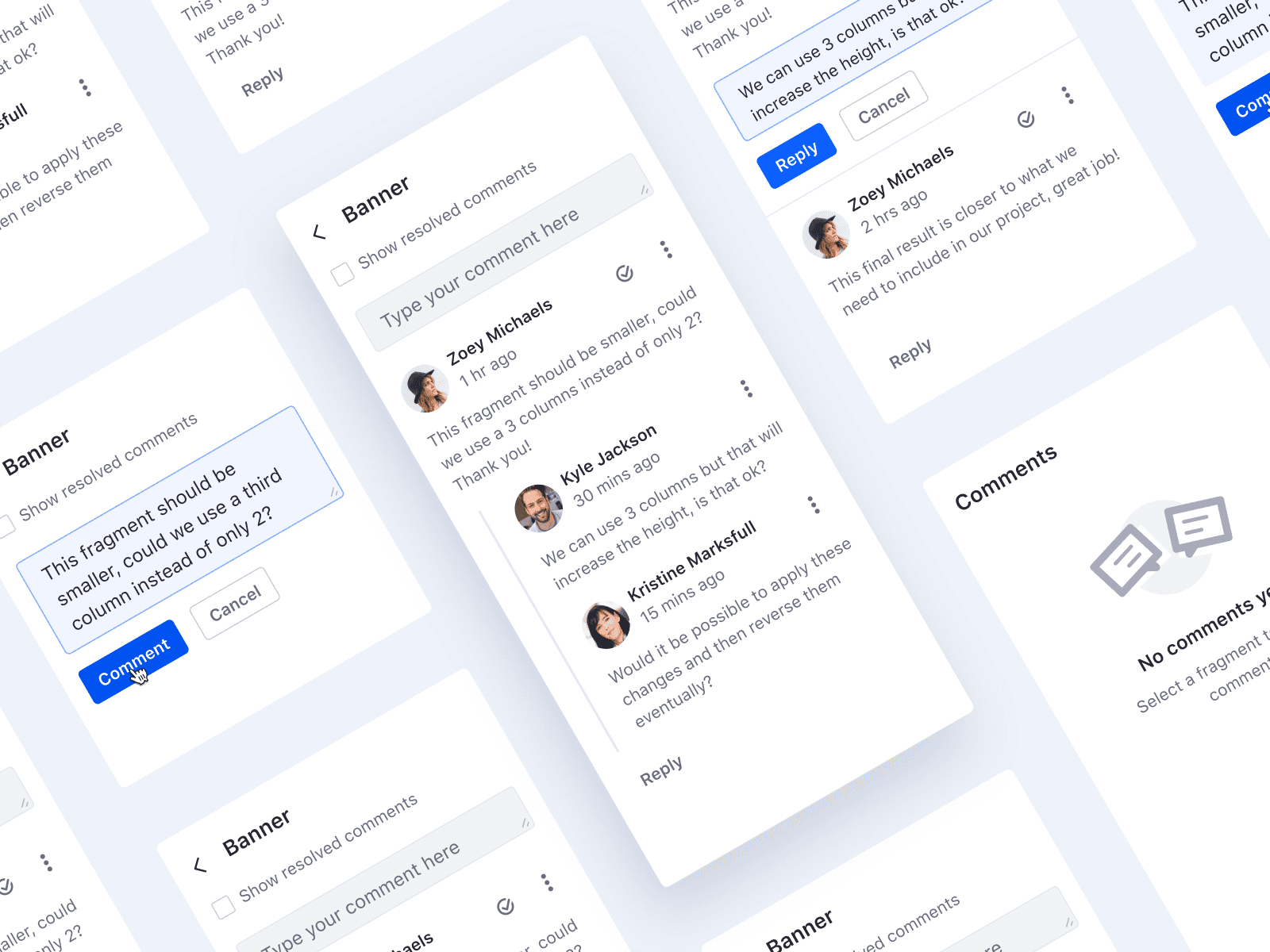
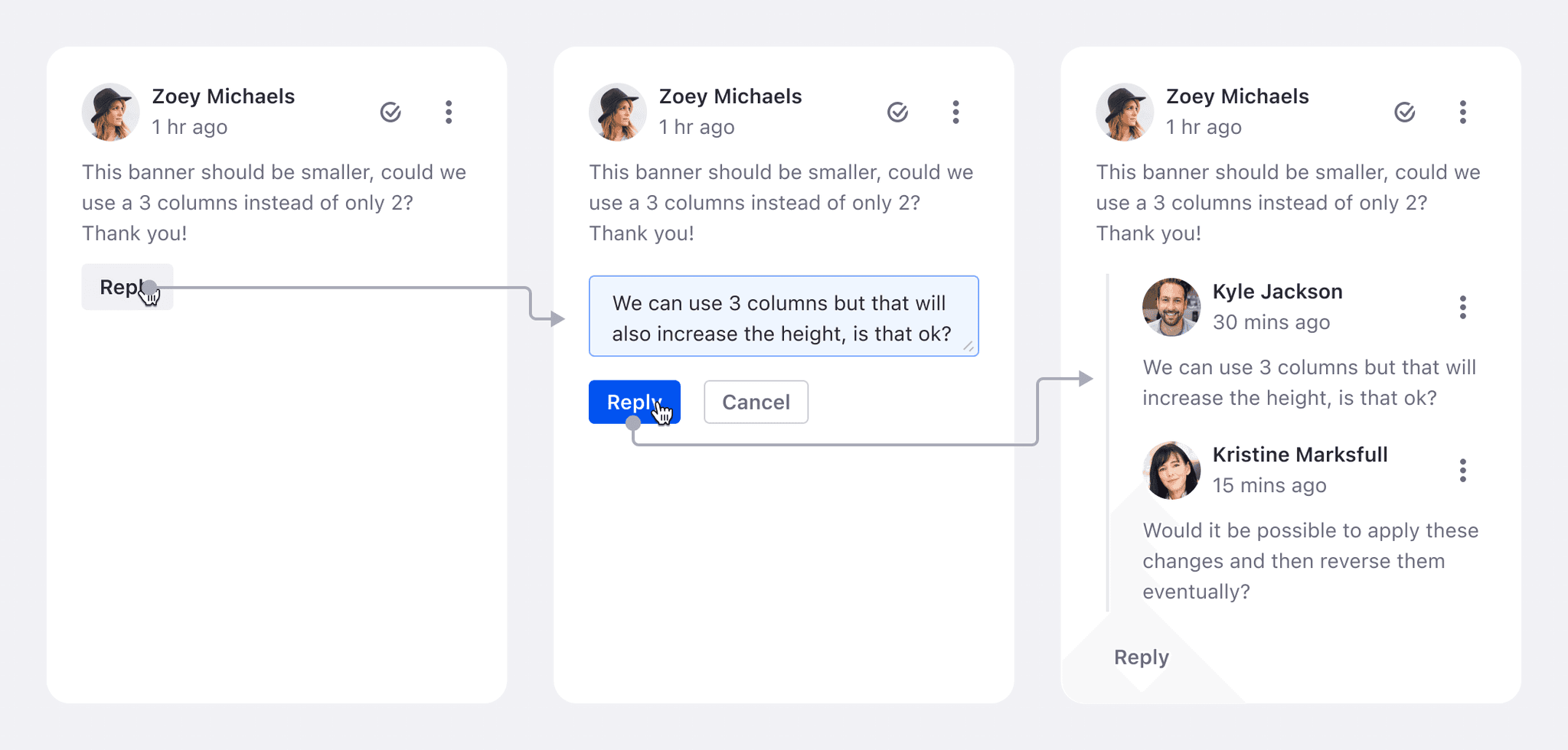
I also wanted to give users the possibility of replying to the first comment in order to have an actual conversation with their team with questions/suggestions and answers/replies.
We provided this option and limited it to only 1 level to make it intentionally simple and direct to the page elements. Any additional reply would be included under the same thread.
Resolving Comments
The site builder is a collaborative feature that in most cases might require feedback comments. Professional workflows require documentation and resolving comments it's a way to have an important source that keeps track of past comments when they're resolved. This generates a hidden archive that users can access by activating a checkbox.
We also implemented a simple animation to provide users with feedback. First, we covered the comment with positive validation feedback, then removed it using TranslationY, ScaleY, and Opacity.
Deleting Comments
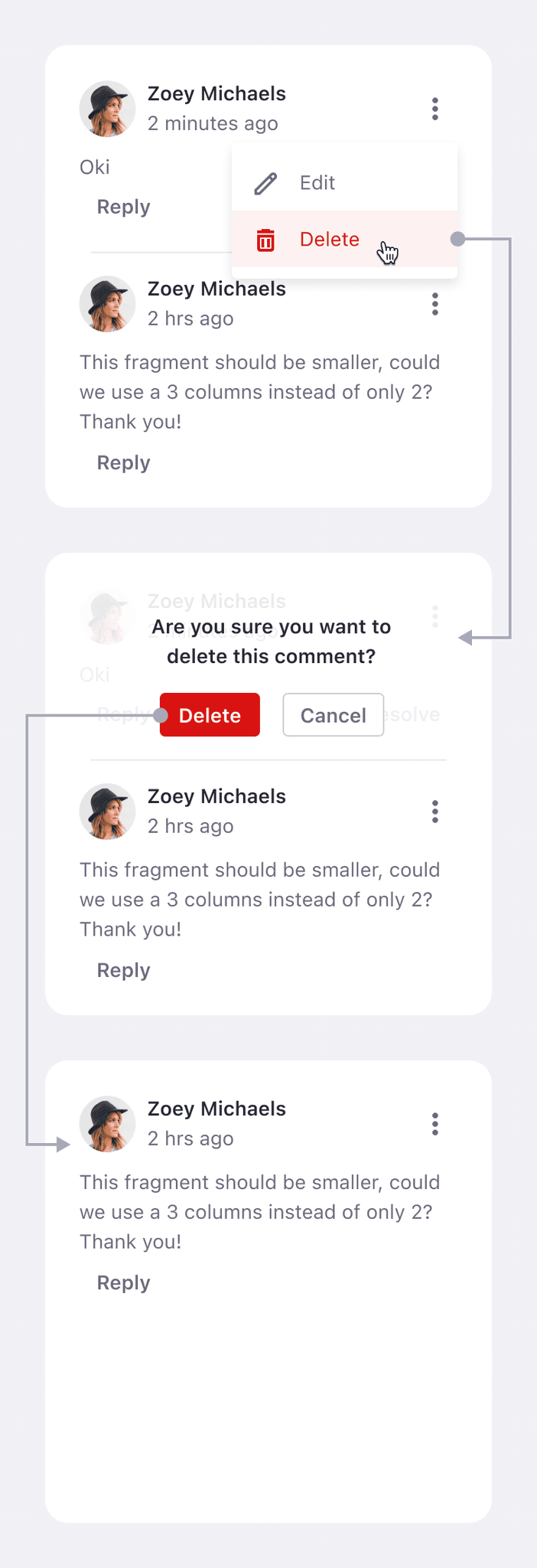
While resolving is great, we also saw that many applications don't allow to delete comments directly and only let users resolve them and keep them in the archive. In our case, we needed to include the possibility for users to delete comments that are no longer useful such as mistakes, duplicates, or a simple change of context.
This allows users to keep a clean and readable archive.
Empty State
I've also designed a small empty state for those cases where the user activates the comments panel without any comment on the page. This helped suggest to users that they could select an element to add a comment.
Results & Impact
Integrated communication directly to the pages' elements
Improved internal async collaboration among customer's team members
Increased customer's internal documentation and reasoning
Improved customer's communication
Reduced customer's quantity of meetings
Designers ended up implementing dedicated empty states to their cases
Learnings
I was able to lead the design for this project which increased my confidence in communicating with developers and product managers directly.
This project led to the opportunity to define guidelines for creating help illustrations that could be included inside empty states and the starting steps of a wizard.
I learned to document the necessary details to allow designers to be comfortable producing the illustrations for their use case while keeping the style consistent with the brand and reviewed by the design system.


