350+ Custom Icons
A Design Journey Through Custom, Handmade Symbols
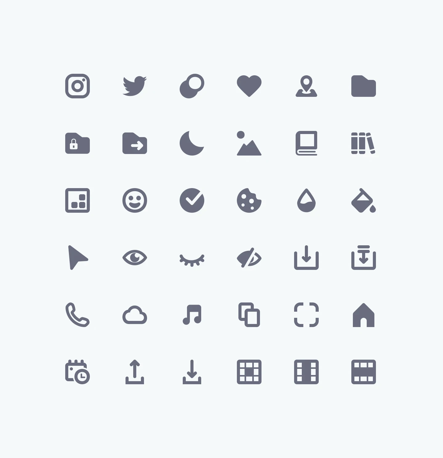
Lexicon has a custom icon set with over 350 icons that were designed internally, most of them by myself. It also includes custom flags of almost every country and language to provide localization and translation features in the product.
Challenge
Like many digital products, Liferay started using an external library to cover its first needs, but growing as a company and increasing the product features also meant that those libraries weren't able to provide the new visual metaphors required for the new features and Trying to use different sets only increased inconsistencies.
Additionally, the styles depended on the libraries and were not aligned with branding.
Results & Impact
350+ icons built in-house
Increased consistency for all the icons used in the applications
Product teams gained the ability to request new icons using the same style with no external cost
Decreased search time of the icons by including metaphors in the system
Seamlessly usage through a dedicated Figma library
Learnings
This project allowed me to explore how to connect symbols and visual metaphors to actions and features in the user interface.
Every detail can contribute to consistency and style, no matter how small, and icons make a huge impact on how the product is perceived visually. Icons are always a great opportunity to connect branding to digital products.
Approach
While icons may appear straightforward on the surface, they often hide subtle complexities. I believe this project is a valuable opportunity for me to showcase my design process when creating icons.
Jira Request
The process starts with a Jira ticket where I get all the information from the product designer requesting the icon.
I check if there is another icon already in the system that could work as a metaphor for that case, if there isn't one, then I start the icon design process.
Desk Research
I check other products that have similar solutions to understand if there's a common or standard symbol that would be a good fit for the icon. For instance, the “eye” metaphor is commonly used to represent “view” or “hide” when closed. Using another symbol would be counter-productive since icons work as a visual aid that increases affordance and learnability.
Icon Concepts
After doing some research, I start drawing some icon concepts on paper or directly in Figma if I have a clear idea that I want to try. This phase is about exploration so I would try different ideas until I get to the final proposal.
Consistency
Working on a set of icons required me to see the big picture while also advocate for the small details and be intentional about the visual metaphors. I defined a set of rules and guidelines to allow everyone to create icons, but also know when is necessary to break the rules in favor of the metaphor.
In the example below, the eye-icon corner radius is the same as the one from the hearth-icon. This also applies for the circle inside that shares the same sharp style of the moon-icon.
SVG Preparation
When the icon design is completed, I export an optimized version of the SVG with reduced vector points. Then, I create a request issue in Github for developers to include the new icon in the SVG Sprite file for a better loading of the whole set inside the product.
Figma Library
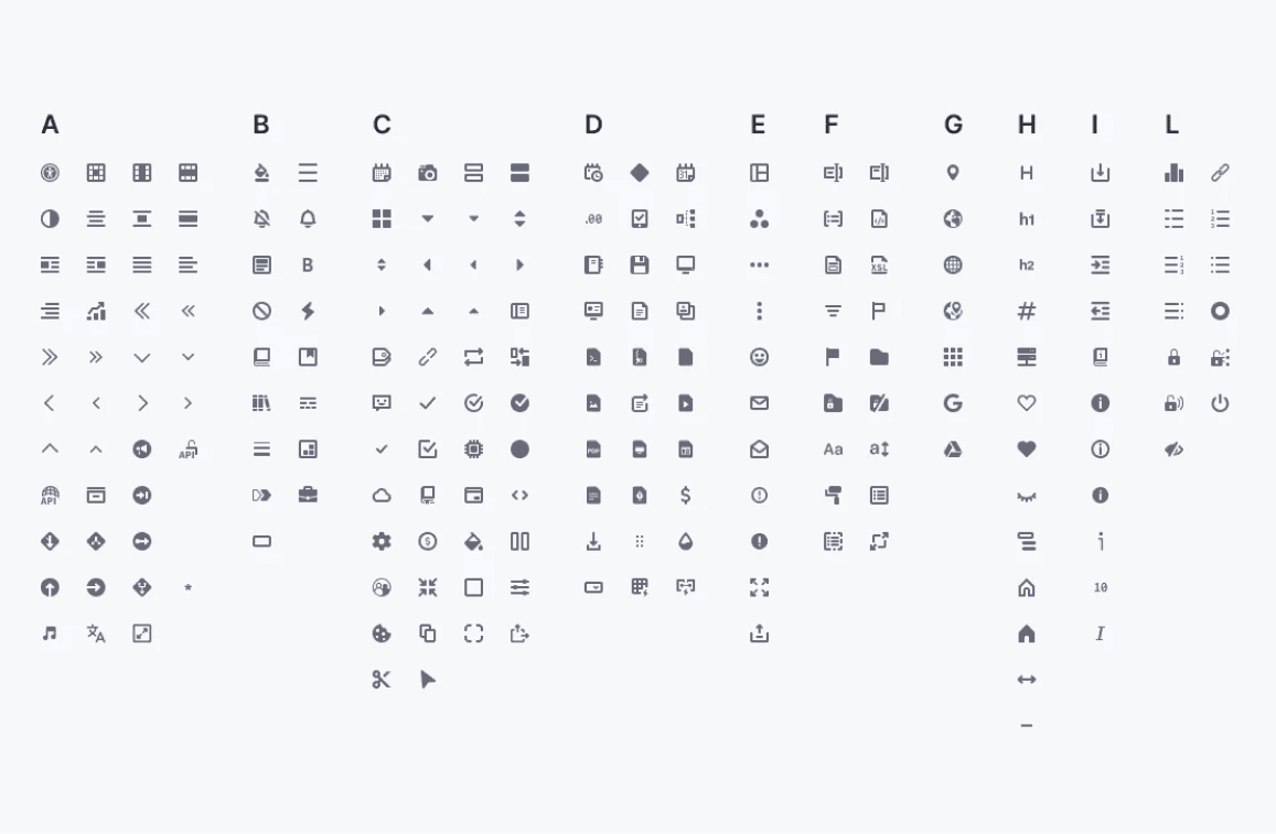
As the last step of the design process, I include the exported SVG as a single component in the Figma icon library for all the designers to use. I order them alphabetically to make them easier to find and maintain, but a trick I use to improve the search is to include multiple metaphors and keywords inside the component's description so that when people look for an icon using another metaphor, it will be indexed in the assets panel.
Eg: eye, view, show, hide, and vision, will all index the eye icon when searching.


